Chart block
How to add a chart to a screen, enter your data, and set the chart type, colours and labels.
How do I add a chart to a course?
Add a Chart block from Add > Chart and pick a chart type, then select Edit data in the block toolbar to enter your own figures. Or paste your data into a message to the AI agent and ask it to add a chart. You can show your data as a column, bar, line, pie or donut chart, and choose its colours, labels and number format.
Use a chart when the point of a screen is a number or a trend: sales by region in a product training course, how training hours split across topics in a staff update, or completion rates by team in a manager induction.
How do I add a chart with the AI agent?
- Open the agent panel and select the Chat tab.
- Paste your data, with the labels in the first column and the values beside them, and ask the agent to add a chart. For example: "Can you add a chart from this data?"
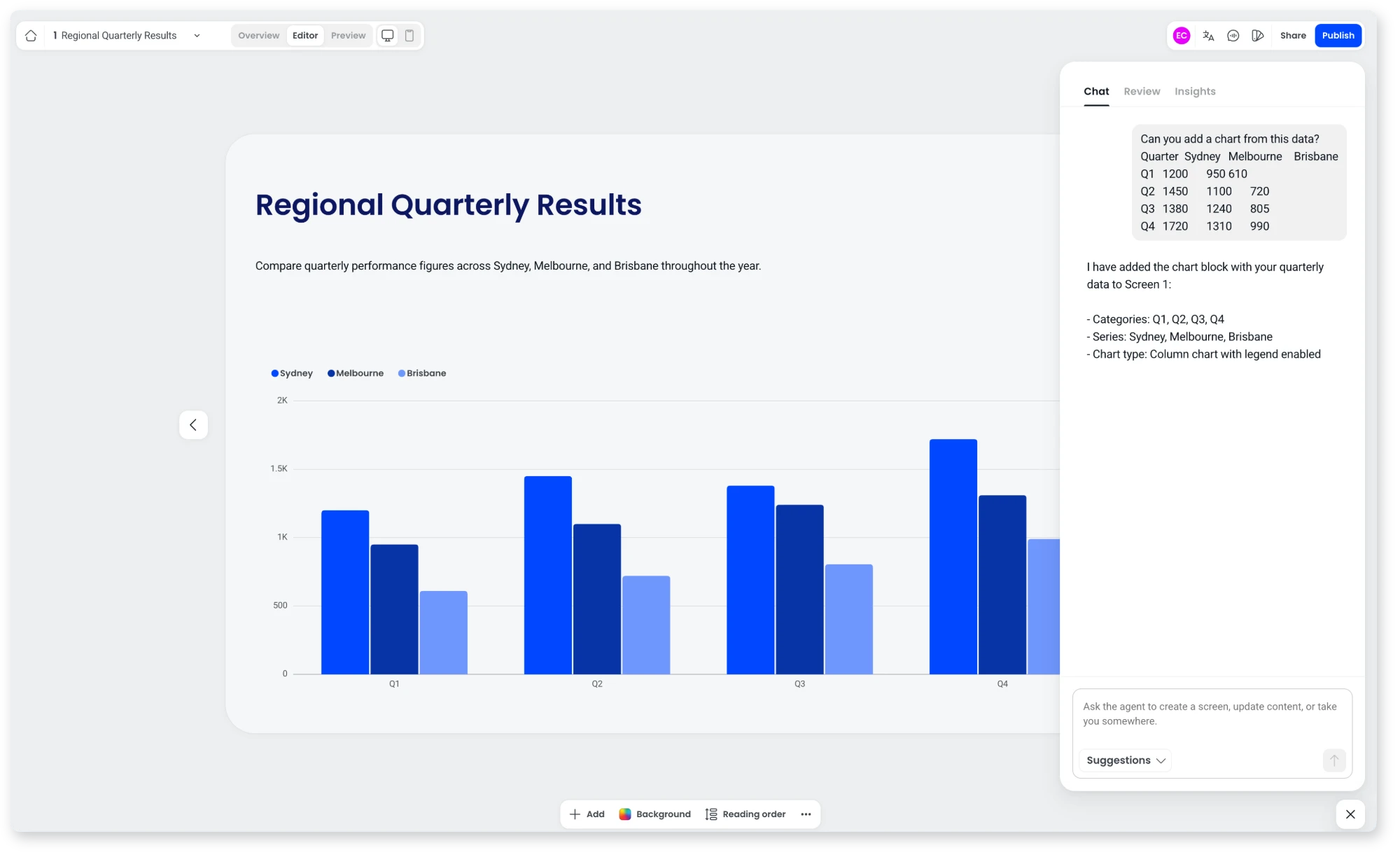
The agent adds the chart to the screen you're on, or to a new screen if you ask for one. When it creates a new screen, it also adds a heading and a short description to sit above the chart. You can keep refining the chart in the same chat, for example "Make this a pie chart" or "Turn on data labels", or edit it yourself from the block toolbar.
Can the agent create charts from my document?
Yes. When you create a course with Create with agent from a document that contains charts or data tables, the agent recreates them as Chart blocks. It only uses figures that appear in your document, taken from a data table or from the values printed on the chart, and never estimates values from the shape of a chart.
If the figures behind a chart aren't in your document, the agent keeps the original image instead. Stacked charts come across as grouped column charts.
How do I add a Chart block to a screen myself?
- Open the screen in the Editor.
- Select Add in the toolbar at the bottom of the screen, or select the + in an empty space on the screen.
- Hover over Chart and select a chart type: Column chart, Bar chart, Line chart, Pie chart or Donut chart.
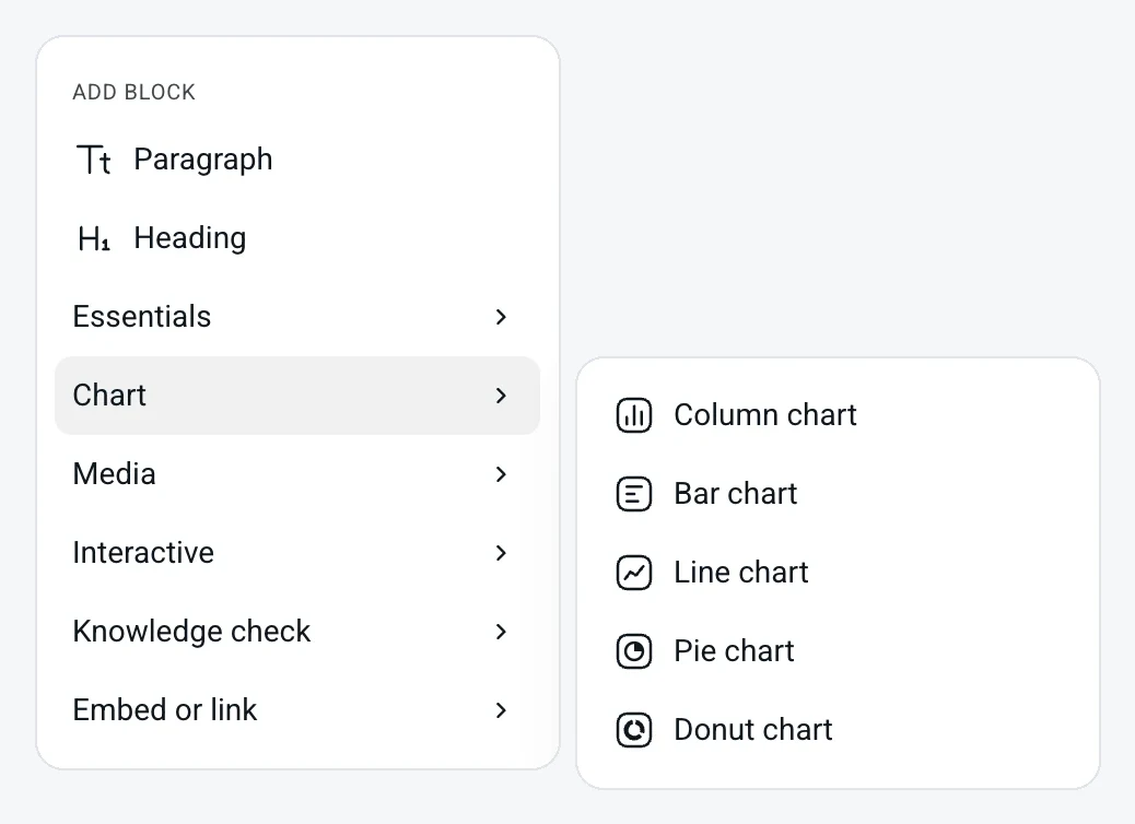
A chart of that type with sample data appears on the screen. Drag the handles on the block's edges to resize it.
To turn a block you already have into a chart, select the block, open the block name menu at the left of its toolbar, and choose a chart type under Replace with.
How do I enter my data?
- Select the chart, then select Edit data in the toolbar.
- In the Edit data window, type your figures into the table. The first column holds your labels, such as months, teams or categories, and each column after it is a set of values shown on the chart. The column headings name each set of values in the legend.
- To add another set of values, select the + at the right of the column headings. To add another label, type into the next empty row.
- Select Save.
Type a symbol with your values and the chart shows it. Enter $100 and the chart shows dollar amounts. Enter 87.5% and the values and scale show as percentages.
To start again from an empty table, select Clear data. Cancel closes the window without changing your chart.
Which chart types can I use?
Select the chart type menu in the toolbar (the chart icon) and choose one of these:
- Column chart: vertical bars. Good for comparing values across a short run of categories or months.
- Bar chart: horizontal bars. Useful when your labels are long, such as team or product names.
- Line chart: shows change over time, such as monthly results across a year.
- Pie chart: shows how a whole splits into parts.
- Donut chart: a pie chart with an open centre.
Your data stays the same when you switch type, so you can try a few and keep the one that reads best.
How do colours work on a chart?
Each set of values has one colour. On a column, bar or line chart with a single set of values, every bar or point shares that colour. Add more sets of values and each one gets its own colour, named in the legend. On a pie or donut chart, each slice gets its own colour from your course theme automatically.
To change a colour:
- Select the colour menu in the toolbar (the palette icon).
- Under Colors, select the set of values you want to change.
- Choose a colour from Theme, which matches your course theme, or from Saved. Select + under Saved to add a colour of your own.
Select Reset colors to go back to the default colours.
What settings can I change?
Select the settings menu in the toolbar (the gear icon).
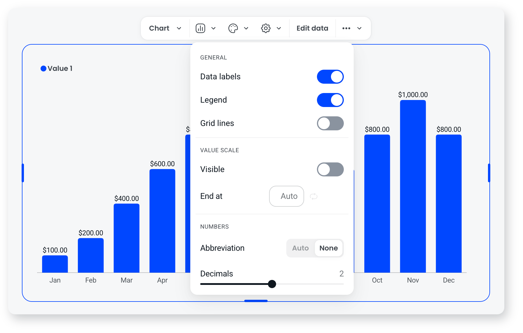
| Setting | What it does |
|---|---|
| Data labels | Shows each value on the chart, beside its bar or point. |
| Legend | Shows the name and colour of each set of values above the chart. |
| Grid lines | Shows lines behind the chart to make values easier to read. |
| Value scale: Visible | Shows the scale of values along the edge of the chart. |
| Value scale: End at | Sets the highest value on the scale. Leave it on Auto to fit your data. |
| Numbers: Abbreviation | Auto shortens large numbers, so 1,000 shows as 1K. None shows the full number. |
| Numbers: Decimals | Sets how many decimal places each value shows. |
Frequently asked questions
How do I show percentages or dollar amounts?
Type the symbol with each value in Edit data, for example 87.5% or $1,200. The chart's values and scale use the same format.
Can I make each bar a different colour?
Not on a single set of values. A column or bar chart shows each set of values in one colour. To give each item its own colour, use a pie or donut chart, or split your values into separate columns in Edit data.
Can I show more than one set of values on a chart?
Yes. In Edit data, select the + beside the column headings to add another column. Each column shows on the chart in its own colour, and the legend names it.
Can I see the exact value of a bar?
Yes. Hover over a bar, point or slice to see its label and value. To show every value at once, turn on Data labels.
Why does my chart show 88% when I entered 87.5%?
Decimals is set to 0, so values are rounded. Open the settings menu and move the Decimals slider up to show more decimal places.
Can I copy or duplicate a chart?
Yes. Open the more menu (...) in the chart's toolbar to cut, copy, paste, duplicate or delete the block.
Why does my chart show $1K instead of $1,000?
Abbreviation is set to Auto. Open the settings menu and set it to None to show the full number.